Last week, the Federal Election Commission (FEC) unveiled their new website at FEC.gov. This new site is the result of a years-long collaboration with GSA’s 18F and features completely revamped tools for exploring campaign finance data. It provides user-centered content for understanding the reporting and compliance requirements for people participating in federal elections, redesigned tools for exploring legal resources, and more.
Why it matters
On the agency’s “About the FEC” page, it says, “The FEC was created to promote confidence and participation in the democratic process.” Providing a modern, user-centered set of tools for browsing finance data and understanding the laws, regulations, and requirements to participate in the democratic process is vital to that mission. This means more informed voters and a more accessible point of entry for getting involved in elections.
But the product itself is only part of the story. The other part is the way that our partners at the FEC have committed to the agile way of working, to the value of open source technology and cloud infrastructure, and to user-centered design. They have been a major part of the project up to this point, and they will soon be taking the reins. Because FEC.gov will need to continue growing and adapting over the years, the fact that our agency partners have been developing the skills and capabilities to lead agile, user-centered projects on their own is tremendous.
How we got here
Instead of starting with the website, improving the experience for the FEC's users started with opening up the FEC's data archives by building a public API. We then used that API to power the new beta site, built in the open at beta.fec.gov. We used this beta site to constantly learn, iterate, and improve, working closely with our agency partners to design, build, and refine new features to meet user needs and to build a practice of writing about complex topics in plain language.
Over the year-and-a-half that we were in beta, the site evolved significantly. We learned some of our early bets — like the way we structured candidate pages or the information architecture of our initial menu system — were not meeting user needs and required totally different design approaches to improve them. Some of the other features needed more detail-oriented fine-tuning, like the filter and tag system of our data tables. We learned from real users via usability testing and our anonymous feedback tool what features they needed, which allowed us to prioritize more effectively. And because we shipped new features every two weeks, we were able to deliver constant improvements to a tool that journalists, academics, and everyday Americans were using to learn more about our political process.
The FEC’s digital offerings are massive, including millions of campaign finance records, thousands of legal documents, and over 40,000 pages of content covering everything from campaign activity guidance to press releases from 1998. And on top of that, it’s always changing. A site like this is never “done,” and work will continue to add to and improve it. But the time has come to make this new site the primary entry point for visitors to FEC.gov.
Highlights of the new FEC.gov
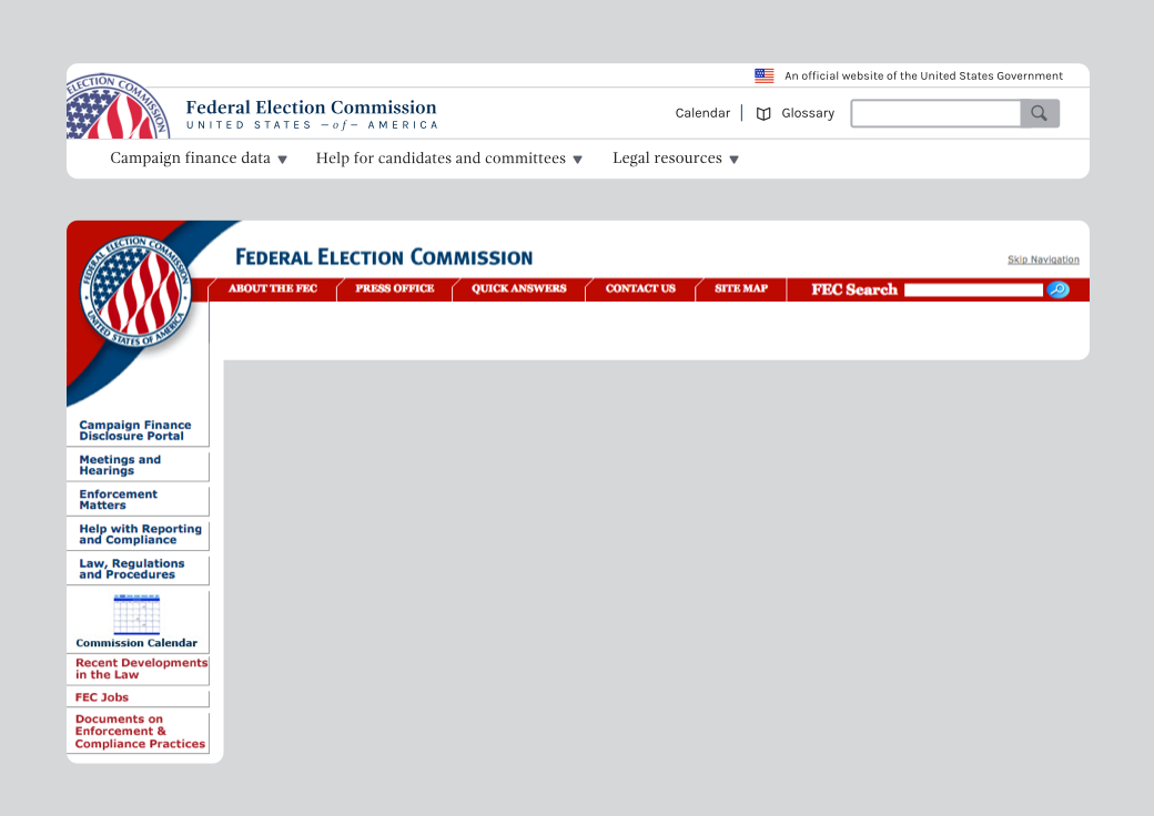
The first thing most visitors familiar with the old FEC.gov will notice is the completely new visual design and the new organization of information. We worked with our partners at the FEC early on to refine the FEC’s visual identity from the broad existing styles choices on the old site into a smaller, consistent set of visual and interaction patterns for the new site.
When the U.S. Web Design Standards launched, we started using their components with the new FEC styles — even contributing back to the project as a use case for research on how to use the Standards with your own styles. Since the site is responsive, it looks great no matter what device you’re using. And whereas the old FEC.gov presented users with over ten different top-level navigation elements, the new FEC.gov reduces the primary navigation to three main items to reflect the three primary focus areas that users need when coming to the site.
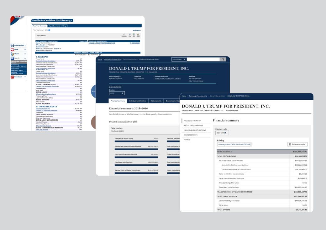
The campaign finance data section has grown since the initial beta launch to include even more datasets — like the ability to get all raw data from electronic filings as soon as it comes in, right alongside processed data — and we redesigned major features like the candidate and committee profile pages based on user feedback.
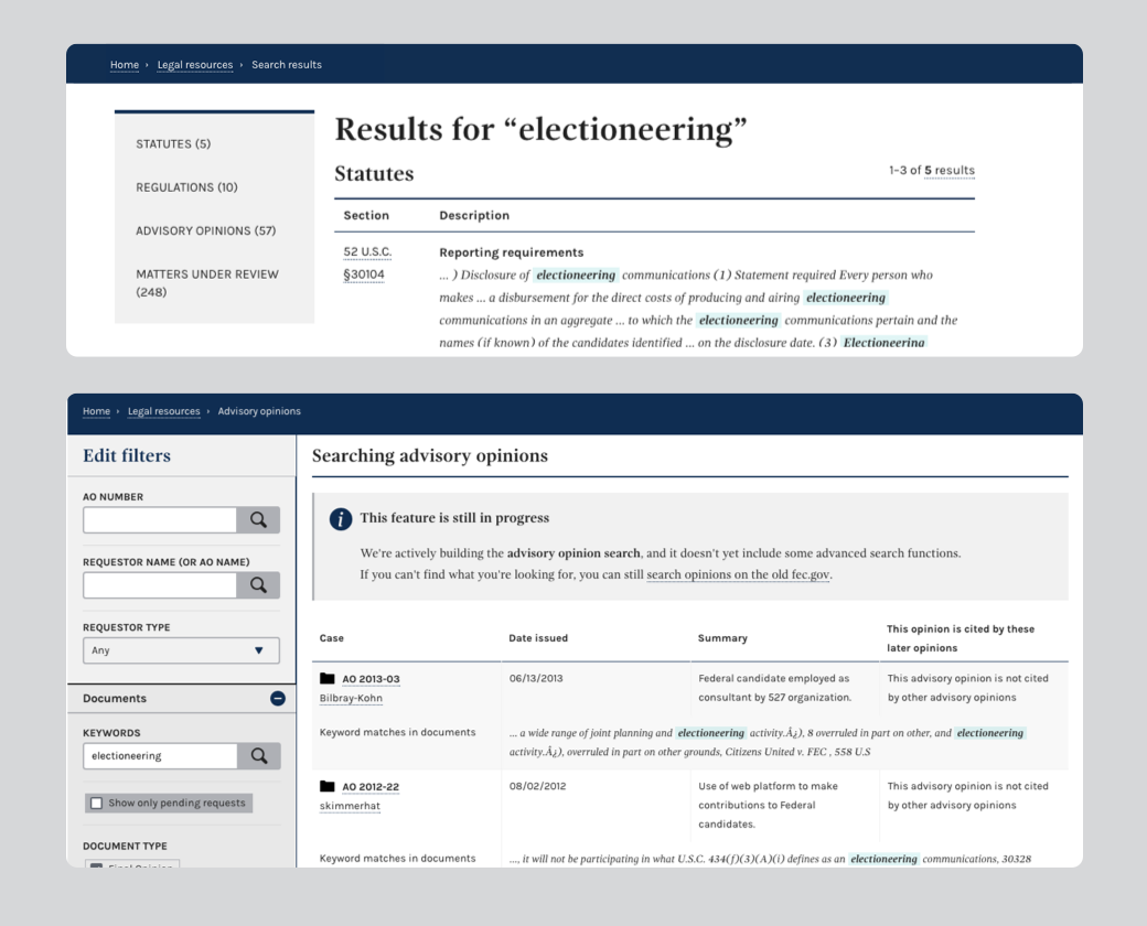
The legal resources section allows users to search through multiple types of resources at once, which previously wasn’t possible. It also includes new ways to explore advisory opinions, which are the official Commission responses to questions about how federal campaign finance law applies to specific, factual situations.
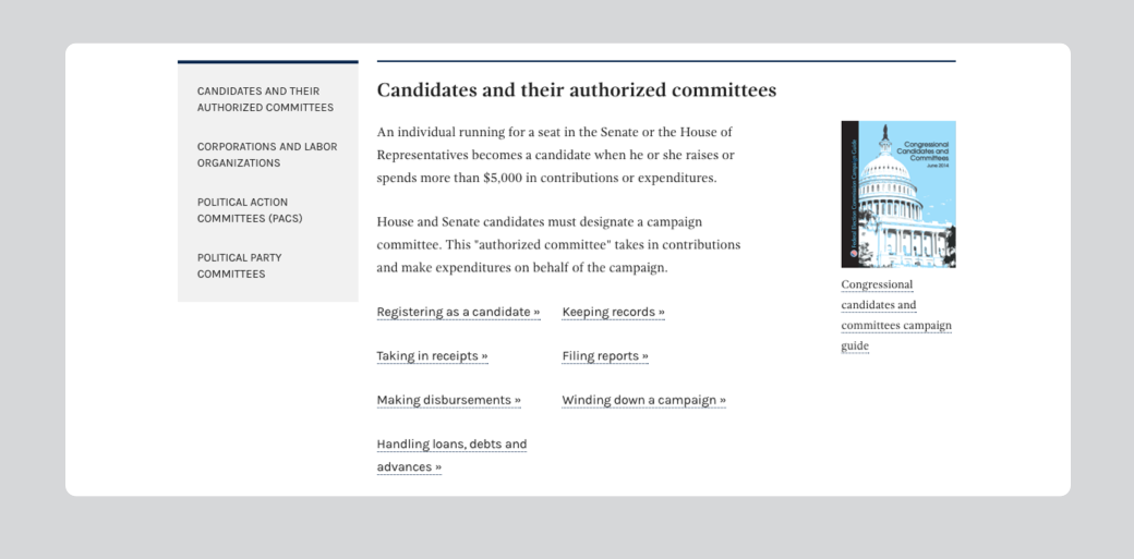
The help for candidates and committees section unifies content that previously lived across several sections and multiple PDFs into a single, user-centered set of pages, giving users one place to look for information.
Under the hood, the entire thing runs on cloud.gov, resulting in cost-savings of over $1.2 million a year, and providing a secure infrastructure that’s easy to deploy and scale to meet demand.
What’s next
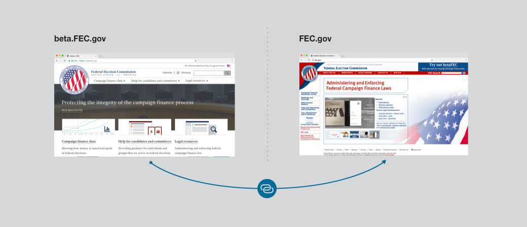
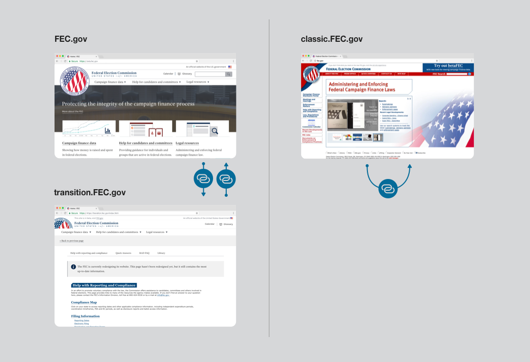
We are now in a transition phase for FEC.gov. There is a new home page and major new sections, but as of today there are still many pages that have not been fully redesigned and some legacy applications that still serve an important role for certain specialized groups of users. These pages are all accessible via the new site, and will live in a sort of hybrid state on transition.fec.gov, combining the new header and footer while retaining everything from the previous site in between. This ensures that the not-yet-migrated content isn’t lost, but also safeguards against users getting lost in between the old site and the new site’s totally different navigation structures. The hybrid pages will stay like this until they are able to be fully redesigned or replaced by new pages or features over the coming months.
Pre-flip
Post-flip, with hybrid transition pages
There are also several major new features we’ll still be working on, including a more powerful search for individual contributions across time, enhancements to data browsing, additional legal resources, and more guidance content.
Meanwhile, we know that change is hard, and a massive change like this carries a lot of risk. That’s why the entire old experience will continue to be available at classic.fec.gov. That way, users who are used to the old way of navigating will be able to have a fallback in case they need it.
There’s still a lot to do and we will continue working with our partners to ensure that this new FEC.gov meets user needs. We're eager to get feedback from real users and are listening by email and on GitHub. But we crossed a major milestone last week, and so to our partners, our users, and everyone who helped along the way, all we can say is thank you.

