Serving America’s diverse population is central to 18F’s mission. To help us further this effort, we’ve adopted a new illustration style to capture a broad spectrum of human experiences.
Previously, we used Pablo Stanley’s Avataaars library to represent people.

While able to depict a range of skin tones and ages, the bust portraits ultimately proved limiting when trying to represent the vast collective of human experiences.
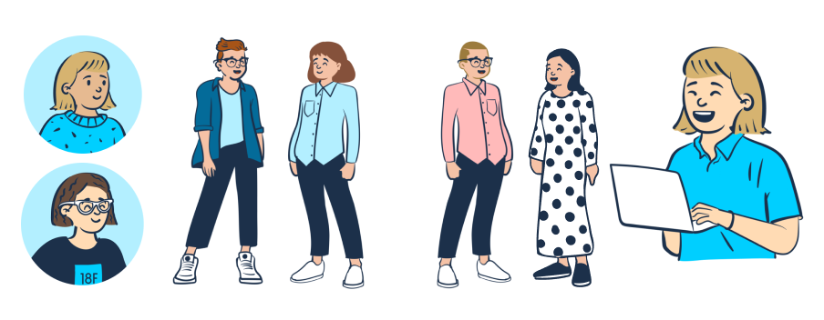
Our new image style is based on Pablo Stanley’s open-source library Open Peeps. We call our version, which reflects the brand’s signature blue tones and flat forms, 18F Folks.
Now our graphics look like:
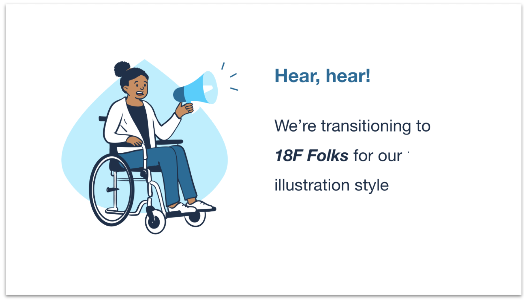
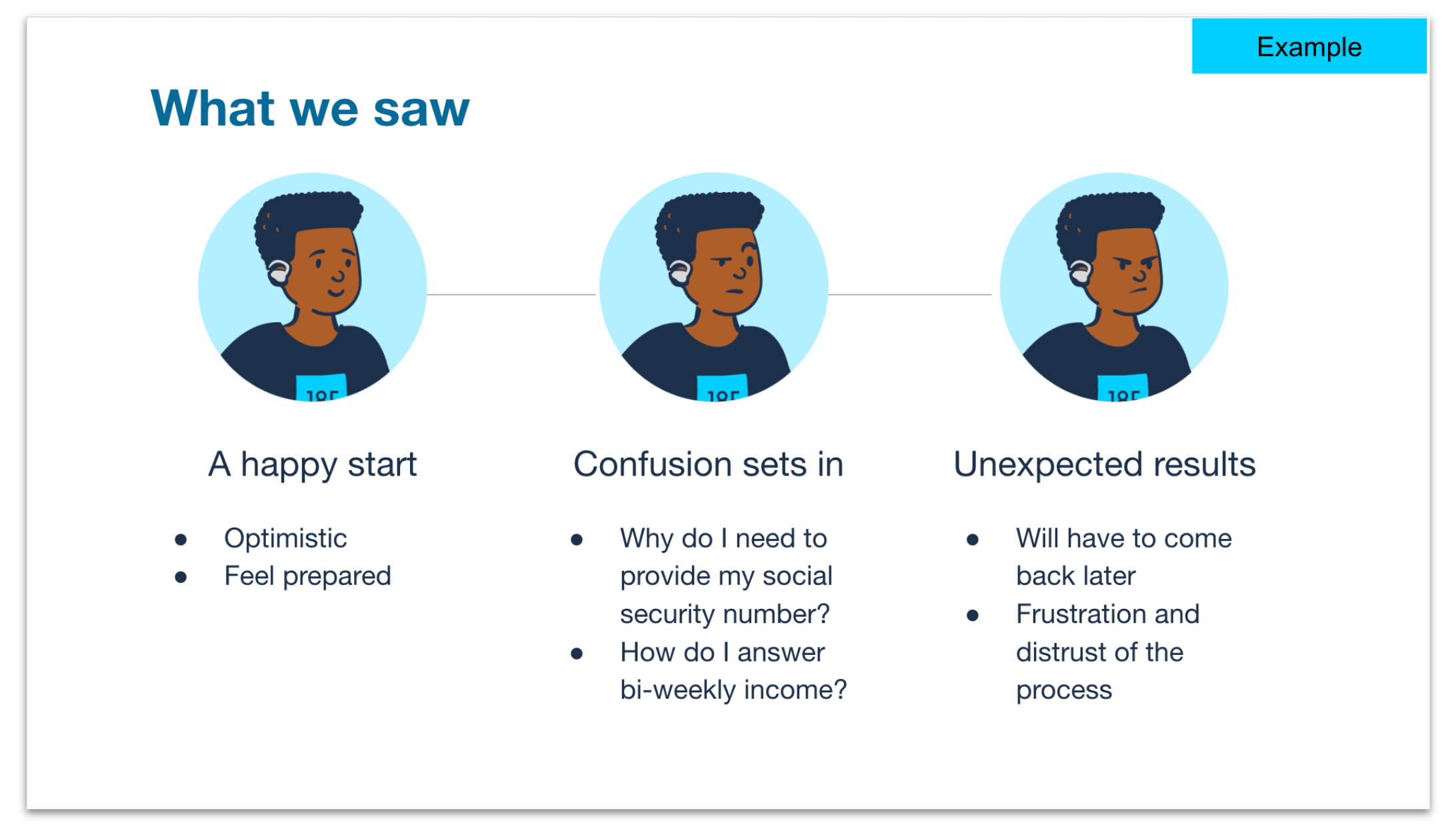
With 18F Folks, we’re able to construct vignettes of people interacting with each other and their environments. This helps us narrate stories about the world we want to build.


As a government agency, we use branding to inform and engage the public. Relationships emerge from the content we share. For instance, government agencies have reached out after reading this blog, asking how to emulate software systems and service processes. Something as basic as our illustration style impacts how our audience perceives us.
Consider this simple presentation slide.
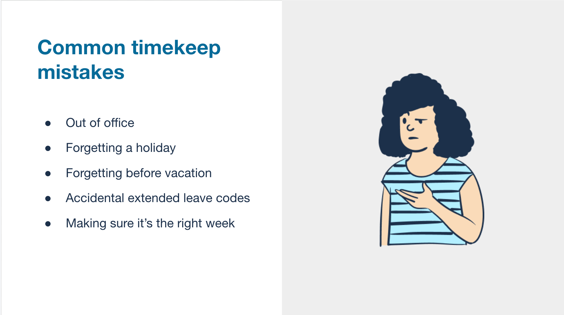
While the content presents a matter-of-fact list, the shrugging Peep conveys the body language equivalent of “I’m with you. This is confusing.” We opted for an illustration style that can cue understanding and trust—emotions more complex than the previous style would allow.
Some organizations may delegate branding directives to a marketing team. At 18F, we leverage the combined strength of our multifaceted design team to bring ideas like 18F Folks to life. Our content designer took inspiration from 18F’s written tone to inform our selection criteria, emphasizing qualities like “welcoming” and “conversational.” Service designers conducted research to determine ideal use cases for illustrations.
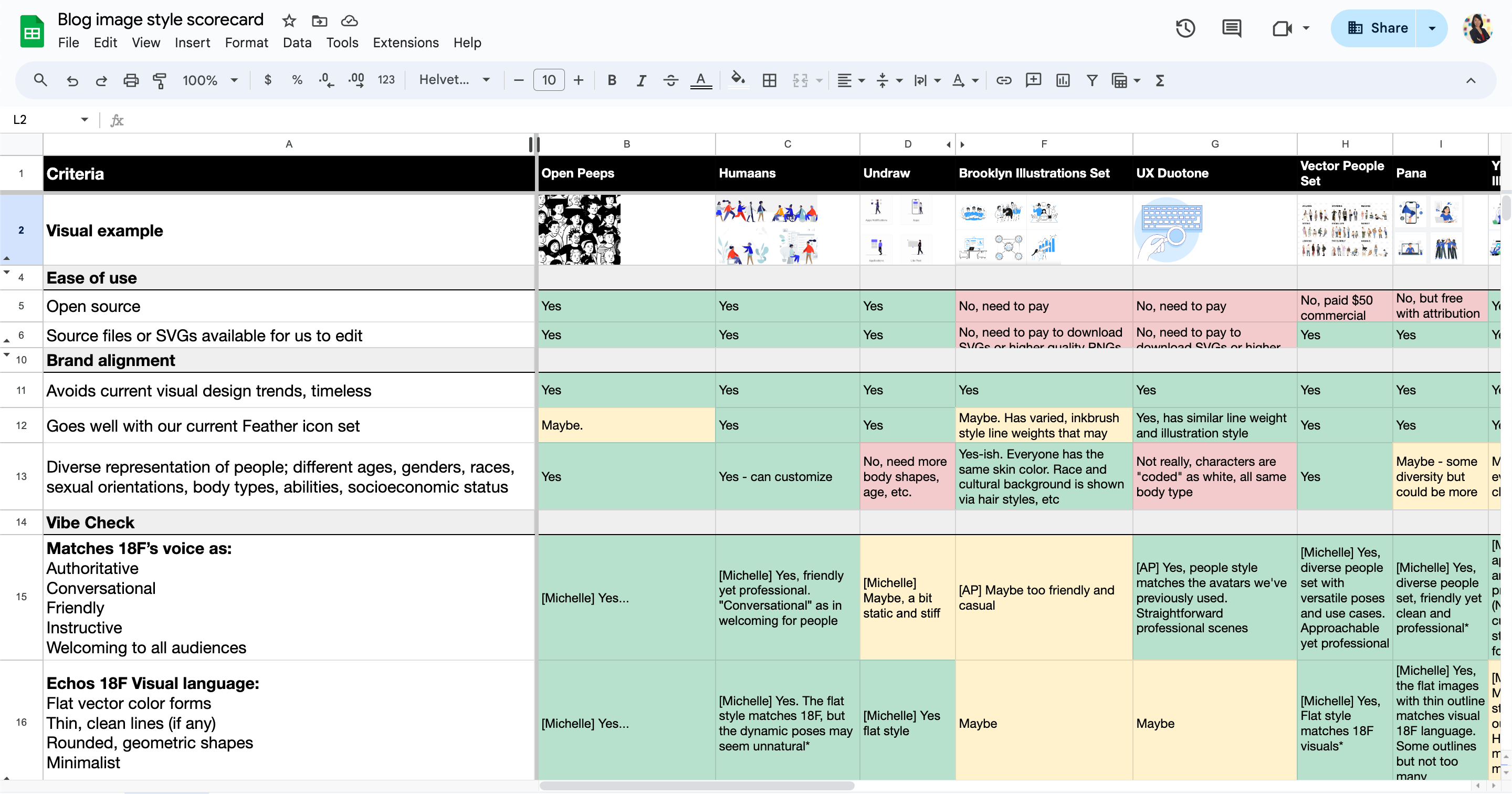
The team then created a scorecard and conducted a comparative analysis of several illustration libraries. Open Peeps was selected as the basis of the 18F Folks style because it balances professional with approachable.
Product managers compiled a list of additional characteristics to make the 18F Folks library even more inclusive. Considerations included diverse religious dress, physical abilities, and body types.
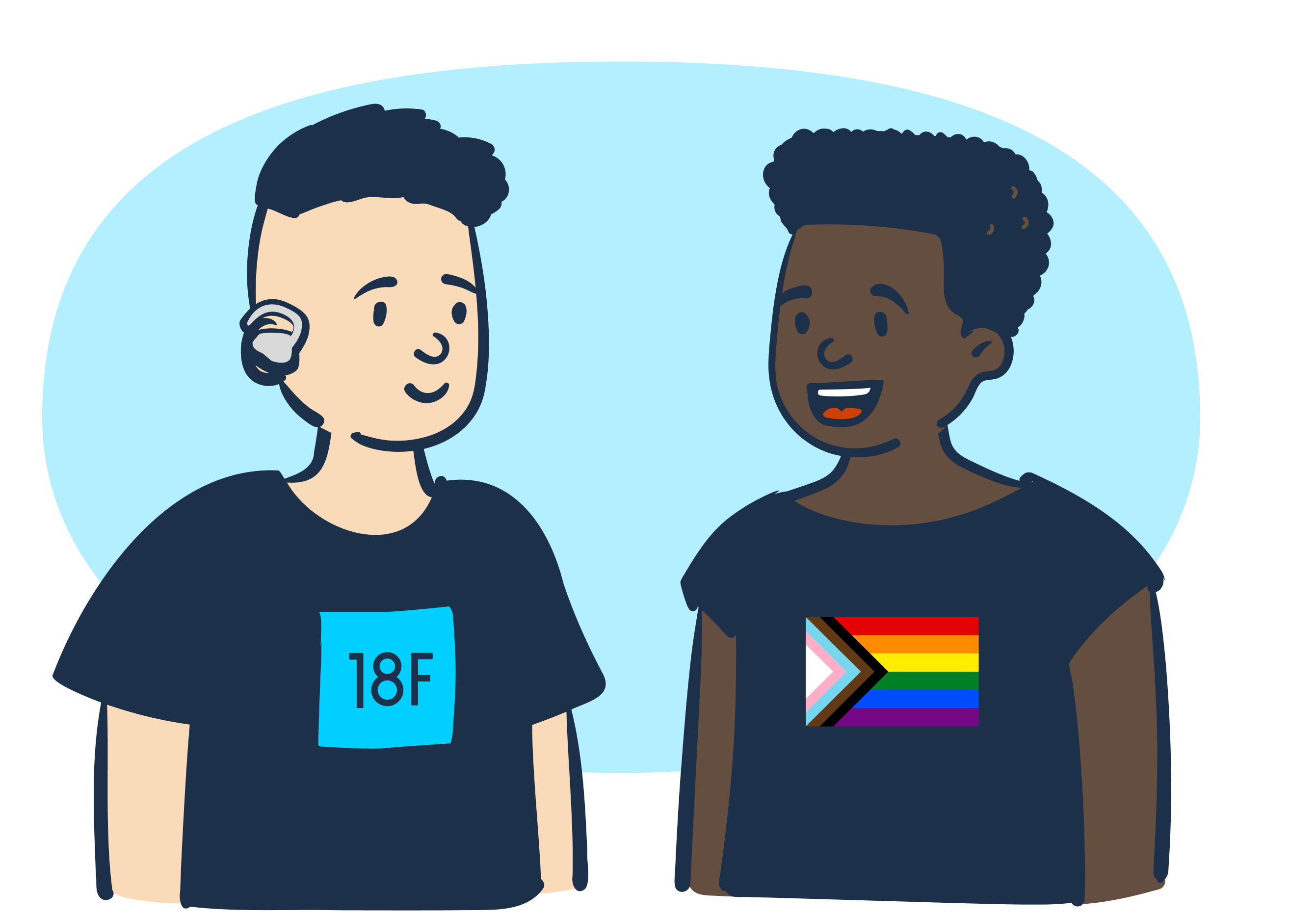
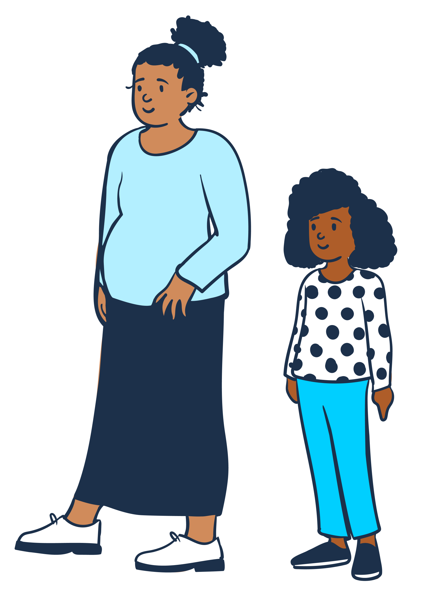
On the surface, these depictions are simply bubbly cartoon characters. But we intentionally adopted an illustration style where more people can find themselves reflected in the content we share. When people can see themselves in media, they feel seen. That’s why it is so important for us to represent the diverse American public. We want every person to believe that they matter to us–that we are a government by the people, for the people. After all, good branding is the public celebration of a group's shared values.
Disclaimer of endorsement
The GSA.gov website includes hypertext links, or pointers, to information created and maintained by other public and/or private organizations. We provide these links and pointers only for your information and convenience. When you select a link to an outside website, you are leaving the GSA.gov site and are subject to the privacy and security policies of the owners/sponsors of the outside website.
- We do not control nor guarantee the accuracy, relevance, timeliness, or completeness of information contained on a linked website.
- We do not endorse the organizations sponsoring linked websites and we do not endorse the views they express or the products/services they offer.
- The content of external, non-Federal websites is not subject to Federal information quality, privacy, security, and related guidelines.
- We cannot authorize the use of copyrighted materials contained in linked websites. Users must request such authorization from the sponsor of the linked website.
- We are not responsible for transmissions users receive from linked websites.
- We do not guarantee that outside websites comply with Section 508 (accessibility requirements) of the Rehabilitation Act.

