
Ask 18F is an advice column that answers questions sent in by federal employees. Our technical experts aim to provide you helpful resources and a good starting point to tackle your problem. Got a question? No matter how small the task or how big the project, email us at 18f@gsa.gov.
Dear 18F: Can you share any tips or suggestions on designing surveys and forms?
Austin Hernandez – Visual designer
UI design tips on designing surveys and forms
Form design is not just a User Interface (UI) or Visual Design question. A good form requires elements of User Experience (UX), research, content, and development. It’s what you ask, how you ask it, what information you’re collecting, and what you intend to do with it. It’s also about how you build it, implement it, and store that information.
For the UI design, I usually start from a boilerplate like the U.S. Web Design System because a lot of best-practice principles are built in. It’s accessible and works on desktop and mobile. When I design a new form from scratch, I use principles from Luke Wroblewski’s Best Practices for Form Design.
For languages that read left to right and top to bottom, here are some simple ways to design a form that will generally help with reducing reading errors and decreasing the time it takes to complete:
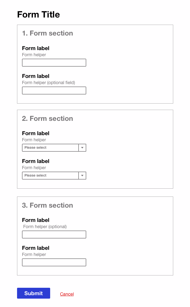
- Align text and form elements to the left so a user’s eyes don’t have to dart across their screen and arraign them in one vertical line.
- Stack the labels on top of the form fields.
- Align the primary call to action (usually
submitornextbutton) to the left, underneath the forms and labels.
- Make the form easy to fill out and appear easy to fill out.
- Reduce visual noise, clutter, and extraneous information.
- Use white space and generous vertical space between elements.
- Add typographic hierarchy.
- Group content sections together.
- Make the form accessible.
- Don’t rely solely on color to indicate required fields or error messages.
- Make sure there is enough color contrast between the background and text.
- Use attributes like
tabindexso user actions are keyboard-friendly instead of requiring a mouse to navigate through a form. - Use tags like
<label>so content types can be distinguished by a screen reader. - Consider adding helper text above an input field so it can be read by a screen reader in a logical order.
- Make content a priority.
- Keep questions to the point, and ordered logically.
- If your form has a lot of questions that are absolutely necessary, you could try a multi-page design, just make sure users know where they are in the process.
- Write labels and instructions clearly using plain language.
- Structure your questions so you get the best data.
- Consider the input type you are using to collect responses (for example long form field vs. radio button vs. short form field vs. checkbox, etc.)
- Keep it human-centered and test with your users!
You can also start off with a out-of-the-box solution like Survey Monkey or Google forms — a lot of research has gone into making those platforms successful. Also, nothing beats usability testing to make sure you’re designing a form for your specific user and business needs.
Here is an example of a form that applies principles like text alignment, grouping, and typography hierarchy.
Helpful links and examples:
- Designing UX: forms
- Designing more efficient forms: assistance and validation
- Plainlanguage.gov
- FOIA’s request form (based on USWDS, visual design by 18F’s Aviva Oskow):
- A11y
- 10 Best Practices for Designing User-Friendly Forms