I first came across the redesigned IdentityTheft.gov on Reddit, of all places.
Someone had posted a link to the Federal Trade Commission’s (FTC) newly redesigned site and wrote:
I hope this never happens to any of you as the entire thing can be really stressful. The identitytheft.gov website is a true breath of fresh air...You can talk to an actual person. They also have this extremely easy wizard to click through your situation and it will auto-generate a "Recovery Plan" including dispute letters, steps to contact law enforcement, putting credit freezes, and basically protecting yourself. It also explains your rights pretty well too.
I visited the site, and completely agreed. Not only was IdentityTheft.gov well-written and easy to understand, it was also clearly designed with end users in mind: the site takes people through a series of clear, well-designed steps that ensure they’ve completed the necessary steps if they are the victims of identity theft.
I reached out to two of the members of the team behind IdentityTheft.gov to learn more about the decision-making process that went into making content and design decisions for the site. Jessica Skretch is a user experience designer and visual information specialist at the Division of Consumer & Business Education at the FTC; Nicole Fleming is a consumer education specialist. They led the design and content of the site, respectively.
Melody Kramer: Thanks for talking with me today! I love how user-friendly and intentional IdentityTheft.gov is and I was wondering if you could detail the research that went into making the site really easy to navigate.
Jessica Skretch and Nicole Fleming: Before we began, we wanted to be sure that we understood our audience really well, so we:
- Conducted user interviews (We talked to 20 victims of identity theft.)
- Compiled and analyzed a lot of data about our audience to inform our team and create personas
- Used internal and external data sources (national surveys, Google analytics, customer satisfaction surveys) to inform our decisions.
We also applied plain language best practices across the board. But probably the most important thing we did was define a goal for the site: “Making it easier for victims to report and recover from identity theft.”
Our team had a strong understanding of our primary audience based on a long history of working with victims via the FTC’s Consumer Response Center as well as our research efforts. That background results in a lot of empathy for this audience because they’re suddenly in this stressful, overwhelming situation, and they want to figure out what to do. That was a strong motivator for making the tone of the site reassuring. We prioritized messages and eliminated things that were potential distractions.
We intentionally and consistently fought for that primary audience and kept other potential distractions off the table. We could easily make a list of other content that would be tempting to include on a government website about identity theft.
However, to serve our primary audience well we had to focus, and not try to speak to every other potential audience. We did try to cross-reference things like prevention information and free outreach materials, but we did that in a very subtle way.
MK: You use checklists on the site. How did you decide upon checklists and why do they work well?
JS and NF: We introduced checklists in our previous iteration of identity theft guidance in 2012 — a print booklet and series of articles on consumer.ftc.gov. So using checklists to help users is not new for us. But I can elaborate on why we use them.

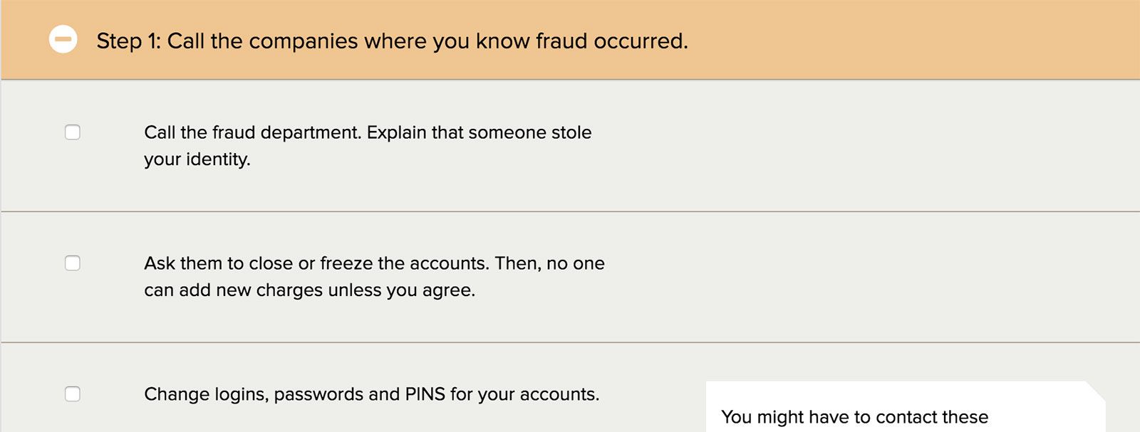
The recovery process for an identity theft victim can vary a lot and include many tasks. We wanted a format for people using the site that was easy-to-follow. We wanted to shift the situation from a person feeling totally overwhelmed to feeling in control and that the steps are doable because we’ve laid them out in a step-by-step plan. People use checklists all the time. They’re familiar and give people a sense of agency. They also show progress. It feels good to check items off the list.
When we conducted interviews last spring, identity theft victims responded very positively to the newer checklist-style materials. They compared text-heavy versions to a “manual” and our newer materials to a “quick-start guide.” They said, “No one reads a manual. We all use the handy one-page guide.” And they said when they were in damage-control mode, they were looking for material that was “short and to the point,” not “a full education on the subject.”
MK: The language on the site is really easy to understand. How did you think about language and what did you do to test the language on the site?
JS and NF: Identity theft victims are in an unfamiliar, stressful situation. They shouldn’t have to do mental backflips to understand our advice. Using plain language that’s familiar and easy to understand is a passion for both of us. It’s ideal to have both a writer and an editor who are committed to plain language because it’s not easy to accomplish. It requires looking at every single word, and asking:
- Is this word necessary?
- Is there a better, more familiar word that we could use?
Listening to victims describe their experience helps a lot. You start to hear the common phrases that people use, as well as what parts of the process confused them and why.
Our writers use tools like Google Trends and Google Analytics to see which word is more commonly searched on our sites and more broadly. For example, one of the most commonly searched phrases related to identity theft is “report identity theft.” So, we made sure to include that on the site and in all of our promotional materials about the site.
We also paid attention to potential areas of confusion when we did usability testing. Words and phrases that cause confusion often become obvious when you watch users thinking aloud and navigating the site. For example, we make a distinction between new and existing accounts because the recovery steps are different. It became clear during testing that users didn’t understand that distinction until we changed the language to “a fraudulent account opened by the thief” versus “fraudulent charges made on your existing account.”
MK: What has the response been since you relaunched?
JS and NF: Generally very positive. We monitor user experience by keeping an eye on stats, our feedback form, and what’s happening on live chat. We get very encouraging feedback, and we also get an earful when someone encounters a technical issue on the site.
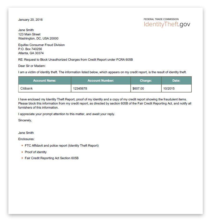
One feature that people have been really excited about is the ability to create letters to send to credit bureaus, businesses, and debt collectors. It takes the guesswork out of the letter writing process.

We’ve also heard from a lot of victim advocates and local law enforcement, who say that they feel confident sending people to IdentityTheft.gov, knowing that the site will help them.
MK: I really like the bar at the top, which basically tells people which phase of the project they’re in. It reminds me of something I read in the Federal Front Door research report, which is that people want transparency into government processes. How did you think about design elements and topics like transparency?

JS and NF: We tried to set proper expectations at each turn for our users. For example, there’s a page right before you jump into the detailed questions that explains that the answers will be used to build your Identity Theft Affidavit and your personal recovery plan. These are the two main tools we provide on the site to help victims recover from identity theft. We wanted people to know why they were answering questions and what they were going to get at the end of it. In the recovery plan, we included additional information in expandable note boxes, in case users didn’t understand why we were recommending certain steps to them.
To really achieve transparency for users, we discovered that we had to find the right balance between giving users helpful information and not overwhelming them with too much information. We had to make tough choices about what to prioritize and what to eliminate, and we will have to re-evaluate those decisions as time goes by and we learn more about our users.
MK:How did you user test this?
JS and NF: We did two rounds of formal usability testing, and our timeline allowed a few days in the middle of each round so that we could make some quick, responsive tweaks to the language or design based on what we were observing.
The first round was an image of the homepage followed by clickable prototypes. Showing the homepage design allowed us to get reactions on the look and feel, as well as the messaging and homepage priorities. The clickable prototypes gave us our first look at users walking through the whole experience six months before launch.
The second round of testing was a fairly robust beta site. Some areas were still in development, but for the most part, the meat of the site was working. At this point, we were able to see users really go through the whole process two months before launch.
After both test cycles, we were able to make quick responsive changes to content and language. We also made improvements to design and functionality. By the second round, time and money constraints forced us to prioritize the most critical changes. Some takeaways from testing couldn’t be implemented pre-launch but were not lost. We’re still actively working on development and rolling out incremental improvements.
MK: What about people who don’t have Internet access? How do they report identity theft?
JS and NF: The FTC offers a toll free help line where you can call and talk to someone at 1-877-FTC-HELP. We encourage people to use the site if possible because it’s available 24/7 and designed to assist you as you work through the recovery process (which has a tendency to evolve over time). IdentityTheft.gov allows you to update your report details, and the site will adjust your recovery plan accordingly. For example, if you discover a second fraudulent account, you can come back to the site, add it to the report, and it will generate the appropriate recovery steps.
MK: Are you noticing more people using the website?
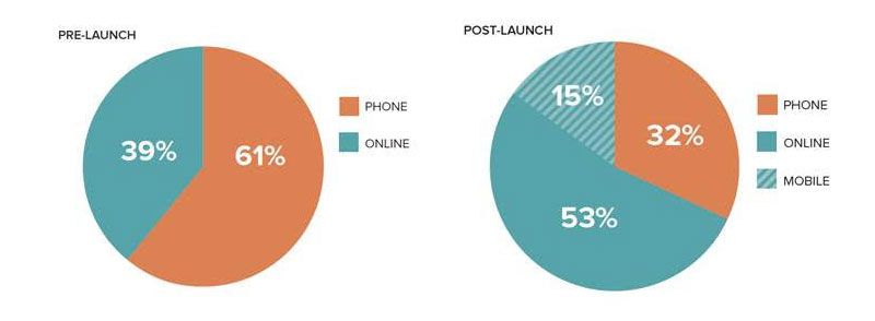
JS and NF: Yes, the total number of identity theft reports we receive has increased and the method of reporting has shifted more to the website, rather than phone. We also have a healthy portion of reports being submitted on mobile devices, which wasn’t possible before.


