When you work for the federal government, accessibility isn’t simply a nice-to-have — it’s the law. That’s why the Draft U.S. Web Design Standards set developers on the path of creating websites that anyone can use. The Draft Standards feature documentation that can help you keep your websites accessible, even after you make modifications.
Every UI component of the Draft Standards is coded and designed to meet Section 508 standards. Below, we offer some best practices for building an accessible website using the Draft Standards.
Start with HTML5 with ARIA
We recommend using HTML5 with ARIA. HTML5 gives developers a lot of role elements out of the box, but it doesn't offer everything ARIA does for accessibility. HTML5 with ARIA provides greater accessibility across a wider range of accessible technology. Here is an example of how we do this with the footer element:
By combining both the footer element and aria-label we have created a more explicit and accessible way for folks to determine that there is a Facebook image link in the footer element of the page.
Testing Section 508 features
We maintain an accessibility checklist and have a list of recommended tools that you can use to ensure Section 508 compliance.
During development, using automated tools like HTML_CodeSniffer or the Google accessibility audit tools is a solid start to make sure you catch common pitfalls in accessibility standards.
We recommend following the Paciello Group Web Components punch list.
For a final release, a manual review is the only way to ensure a quality user experience. We recommend using a screen reader and an accessibility API inspector tool such as Microsoft’s Inspect tool, available in the Windows SDK, or Mac OS X's built-in screen reader, VoiceOver.
Developed with WCAG 2.0 AA in mind
We developed the Draft Standards with WCAG 2.0 AA in mind. The upcoming Section 508 Standards refresh references WCAG 2.0, which covers a wide range of recommendations for making web content more accessible.
Working with the CIOC Accessibility Community of Practice
We were able to correct an accessibility citation quickly with the help of John Sullivan, the Section 508 Program Director. We’re looking forward to working more closely with the Access Board to monitor the state of accessibility in the Draft Standards.
Documentation
Copying and pasting code without changing ARIA attributes for your use case is just as bad than leaving them out completely. To combat this, we included documentation with every component that includes how and when to modify the code to ensure it stays accessible, along with general best practices that apply to something thematically, like forms templates.
Colors (In relation to WCAG AA 2.0)
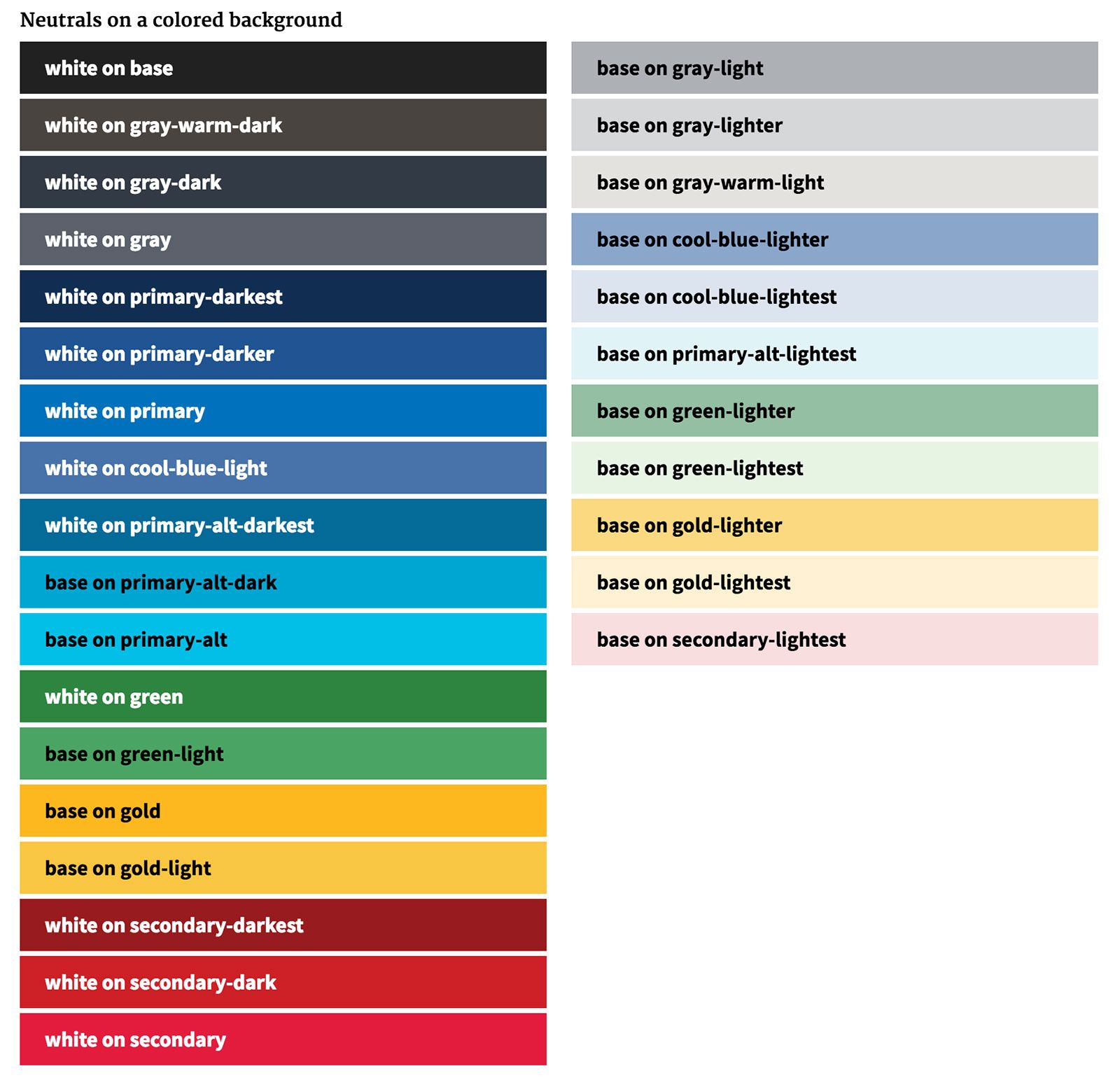
A flexible, yet distinctly American palette was designed to communicate warmth and trustworthiness while meeting the highest standards of color contrast requirements. Our colors meet WCAG AA with examples of how to use them in combinations. People may need to change colors for their agency’s needs so we encourage them to test the combinations themselves. Teams can use WebAIM's Color Contrast Checker) to test foreground and background options and adjust their lightness and darkness until they pass contrast requirements.

By implementing these practices and leveraging the Draft Standards, we hope to help create guidelines that will set you on the path to creating accessible websites for everyone to use. If you have suggestions or questions, please feel free to leave us feedback on GitHub.

