
On July 28, 18F kicked off a new project with the Department of the Interior’s Office of Natural Resources Revenue (ONRR).
Later this year, ONRR will be launching a new website — originally prototyped by Round 2 Presidential Innovation Fellow Michelle Hertzfeld — to facilitate national and international conversation around U.S. extractive industries revenue. It will serve as a valuable resource for data and information about U.S. extractive industries on Federal land, and will also provide interactive visualizations that can be readily understood and accessed by the public for reuse through other media and applications.
This will all be a part of the U.S. implementation of a global transparency standard for natural resource governance called the Extractive Industries Transparency Initiative (EITI). EITI is a global coalition of governments, companies, and civil society working together to improve openness and accountable management of revenues from natural resources including but not limited to oil, natural gas, and coal. The U.S. is the first G7 country to sign-on to and implement the new EITI standard. To learn more about the U.S. process for implementing the EITI standard, check out the USEITI homepage.
18F’s task is to refine Michelle’s original design and develop a simple and informative experience for:
- Members of the general public who want to learn about U.S. extractive industries revenue and how these revenues impact them on a local level;
- Researchers and data scientists who want access to the raw data for analysis purposes.
Over the course of a project, we often conduct one or more workshops. Three weeks into the USEITI project, we decided to hold a design studio to solve the problem of how to convey complex revenue data. We needed to better understand the difference between onshore revenue (revenue from natural resources extracted from land) and offshore revenue (revenue from resources extracted from Federal offshore or the U.S. outer continental shelf) as it relates to our system.
What’s a design studio?
A design studio is a structured workshop that guides its participants through the process of understanding a problem. Through sketching, presenting, and critiquing ideas, the goal is for the group to arrive at a shared vision of a potential solution to the problem at hand. In our case, our shared problem was how to convey complex information about natural resource revenue in an intuitive way.
Ideally, a design studio brings together a group of people with diverse and balanced skill sets (for example, design, product management, and domain expertise). These diverse people bring diverse ideas, which in turn create unique and high-quality joint outcomes. If you can draw a stick figure, then you can be an effective design studio participant!
How does it work?
In the case of USEITI, we invited representative users and stakeholders from both inside and outside of government to participate in a four-hour workshop.
First, we laid out the ground rules:
- Everybody is a peer
- Start with user needs
- No saying “no” to things
- Everybody draws
Next, following a round of introductions, we dove right into the collaborative design process.
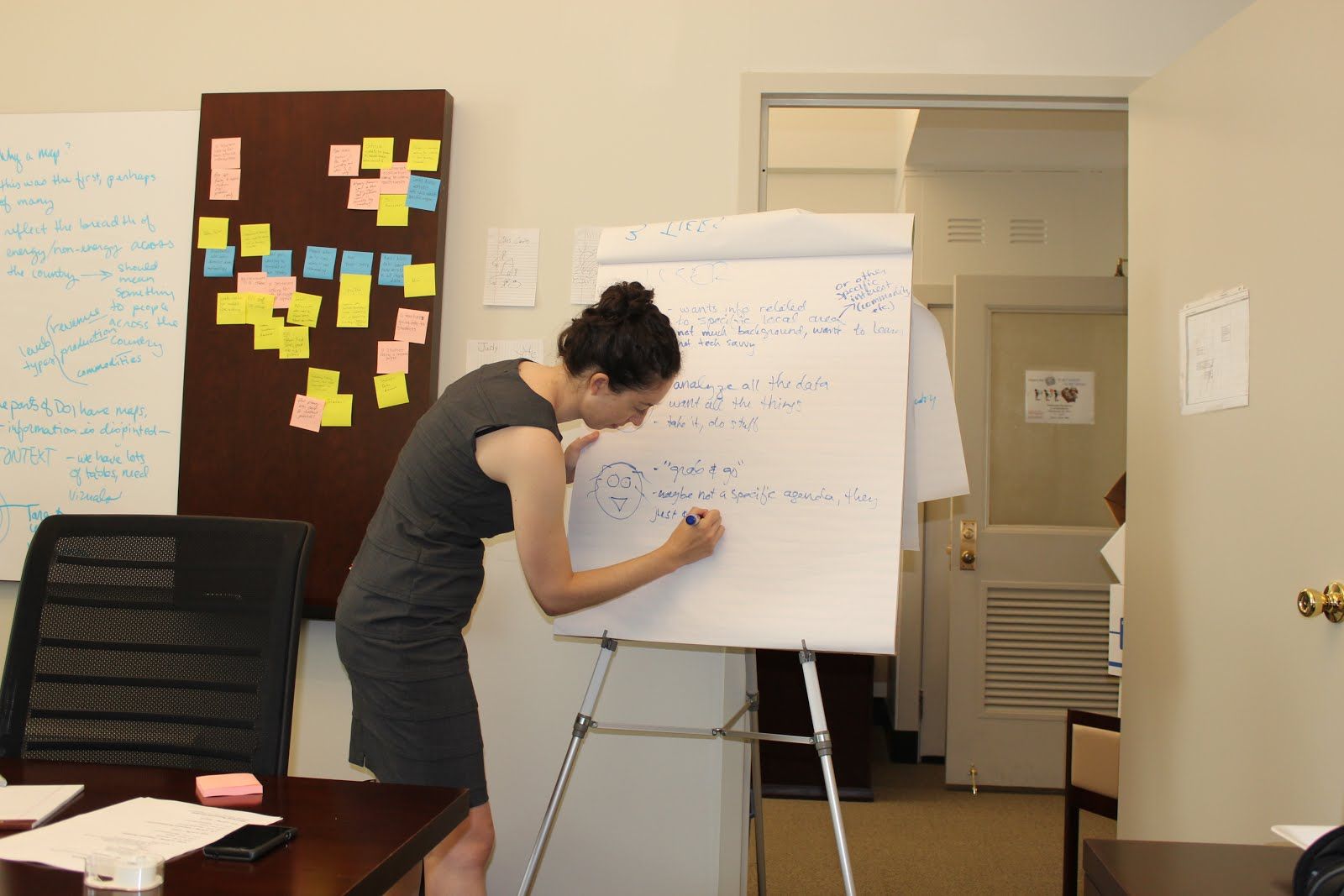
Creating user personas. Based on the participants’ previous research on users, the group developed user personas to serve as examples of the types of people who would interact with the website. We did this by brainstorming possible user goals, behavior patterns, skills, attitudes and environments, and then condensing these into representative groups through affinity mapping. The resulting personas give users actual characteristics — names, faces and narratives. This helps our design studio participants (and our 18F team designers!) shift focus away from meeting specific requirements and deliverables, and onto meeting the needs of the users.
 _Building user personas_
Sketching. Next came rapid rounds of sketching. Participants chose a specific user persona to design for, and each individual was asked to produce 5 sketches in 8 minutes depicting how to meet that user’s needs. After the buzzer told everyone to put their pens down, all participants presented and critiqued each other’s sketches. To do this, we focused on: “Does the design satisfy the goals of the user persona?” and “What assumptions does the design make that we want or need to test?”
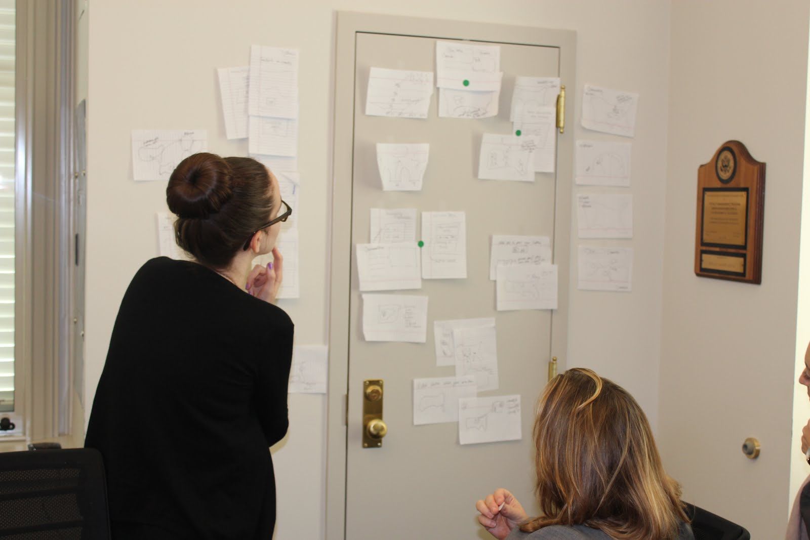 _Critiquing the first round of sketches_
We didn’t focus on whether the design was pretty or technically feasible; we simply wanted to generate ideas we knew would delight our user personas. This process — sketching, presenting, and critiquing — was repeated until the group converged on a clear set of winning designs.
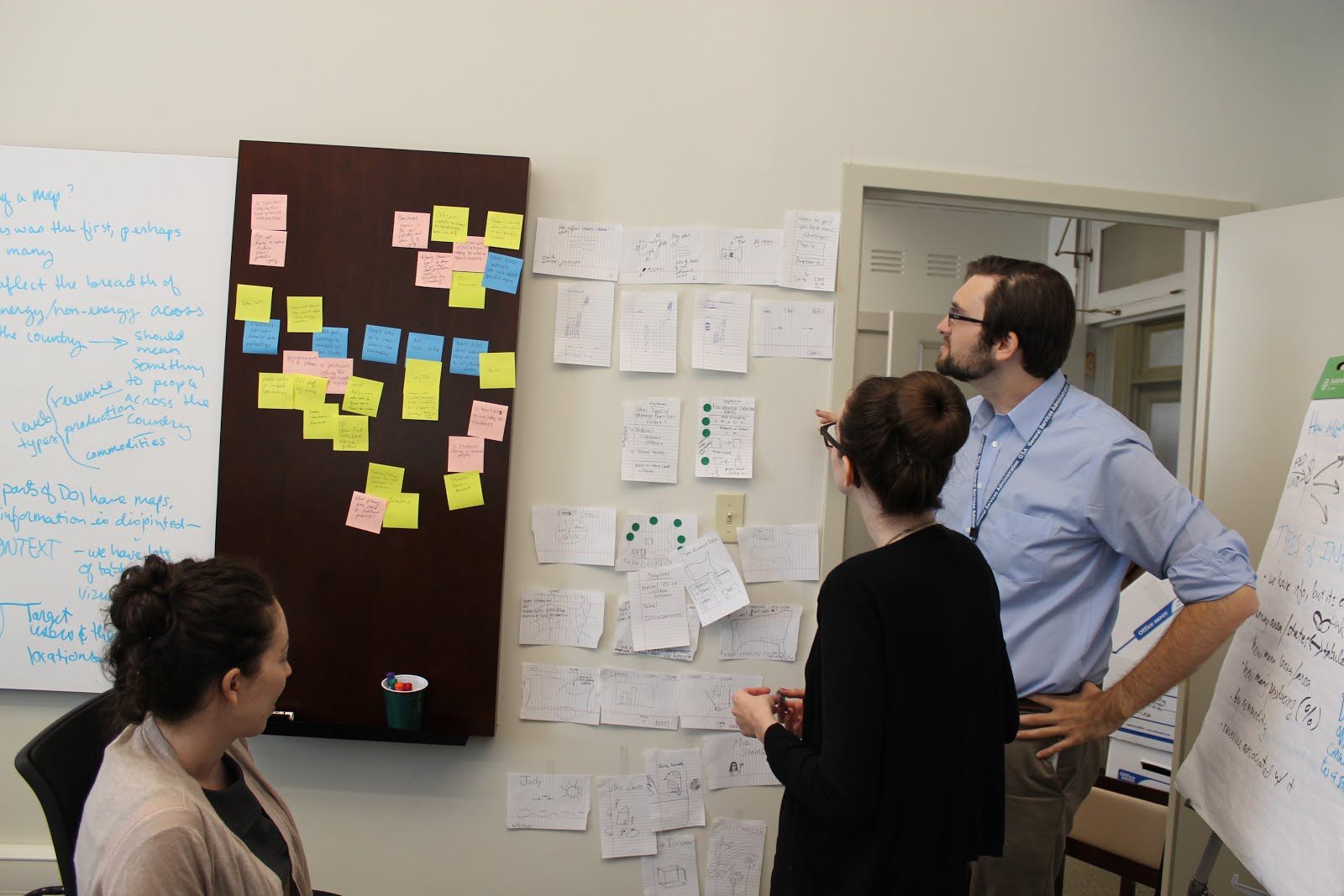 _Second round of sketches producing some clear winners!_
What’s next?
Exhausted, but excited, the group walked away at the end of the session with clear direction for designs that we can build and then test with real users. Work on this project has just begun, and user-centered design requires more than theorizing. It requires continual testing of our design decisions and assumptions to ensure the needs of users are being met.
18F will also continue to work on this project in the open and in public. That means quickly moving beyond designing for the public to designing with the public.
We’re interested in finding out ways to work with you that go beyond the software code to how the things we’re building actually work. Look out for upcoming opportunities to collaborate! To stay up to date on our work on this project and others, follow us on Twitter.