
We recently worked with the cloud.gov team to update their public site, cloud.gov, to United States Web Design System 2 (USWDS 2). This was our first time digging into Version 2 of the system. Using the latest version of the web design system let us easily correct some usability concerns with the site, and work towards compliance with the 21st Century IDEA web design standards.
Designers and developers use different tools and vocabulary to deliver government digital services and the USWDS provided concepts we were able to use to translate designs into code a lot faster and deliver higher fidelity results once we understood how to use them.
Theming
USWDS provides variables, scss, and structure for custom themes that lets teams customize their government websites. Themes allowed us to use the consistent development and design patterns of the USWDS while showcasing cloud.gov’s unique brand identity. We learned that these themes are extensive and allow lots of flexibility to design sites that reflect an agency’s visual style. We leveraged the default user experience behavior of the USWDS 2, while updating the colors and typography to match the brand identity of cloud.gov.
The themes are modified by updating the variables in Sass (Syntactically Awesome Style Sheets)
dist/scss/theme folder of the USWDS
project.
To update the theme, you’ll need a build system that recompiles your CSS. We used this built-in capability with Jekyll running on Federalist.
For more on how the themes work, take a look at the USWDS documentation.
The USWDS SCSS files are broken out by area including color, components,
spacing, typography, and utilities. Since our theme included cloud.gov
fonts, colors, and layouts we copied the entire theme directory and then
referenced it from our main SCSS file,index.scss.
To organize our custom styles, we followed an internal practice of
placing new styles into our index.scss and put adapted USWDS element
styles into the uswds-theme-custom-styles.scss. For applying themed
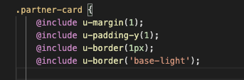
elements we used the great USWDS utility classes if we wanted to
change a single element, and the utility or token mixins if we wanted to
apply that pattern to multiple elements or wanted to apply a number of
styles to a single element or class. We may not have been perfect in
keeping this consistent, but in general we tried to follow the principle
of Don’t Repeat yourself (DRY).
|
|
| Utility class | Utility mixins |
Colors
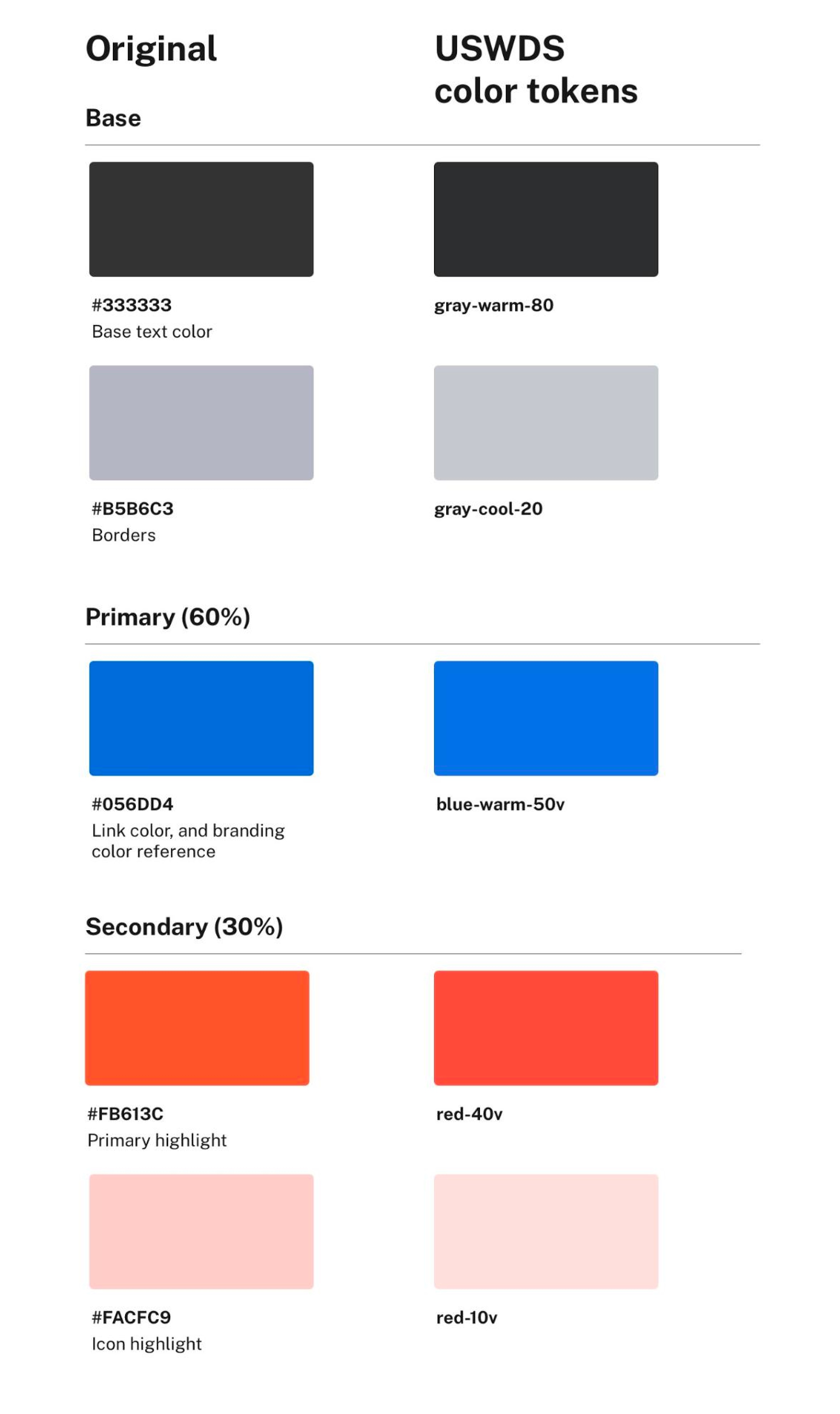
We wanted cloud.gov to be easy to recognize, and color can be a powerful identifier for sighted people. One of our first steps in the USWDS migration was to audit the color space on the current cloud.gov and map those colors to the USWDS2 theme using color tokens.
USWDS2 has a default color theme of blues and reds,
but also recognizes that not every government site should look the same.
The system includes a color library of 24 graded color families
that map to preset CSS variables and classes to give teams flexibility.
This robust color system made it easy for us to find the USWDS color
tokens that matched cloud.gov’s branding. It also gave us a vocabulary
to talk about colors without having to use hex codes. Soon, we were
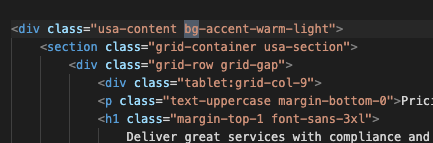
talking about how the sidebar background should be accent-warm (USWDS color token gray-warm-10) rather than #E6E6E2.
In the design files, we were able to use the USWDS color library to test and import colors into our design. USWDS color tokens include a graded system that helps designers check color contrast on the fly, so we could make sure our designs would be accessible. We chose to create a single color library for the entire theme, which made it easier for us to see how theme colors interacted with one another. The USWDS team recently updated their design assets to include a more consolidated design library and palette builder to make this process even easier.
USWDS provides CSS classes that map to the color theme out of the box, which made it easy for us to prototype collaboratively on the fly. However, it did take us time to learn how theme variables were applied by default. There were undocumented assumptions about color usage that we had to learn as we worked. For example, it took some digging to see how theme variables map to USWDS components. And, when vivid tokens are called compared to more muted siblings. We also had to learn which theme colors were required and which were optional.
Grid
The USWDS grid system lets us communicate layout and responsiveness easily and without discussing pixel values. By using the same grid system in design mocks and in code, it was easy for us to document and troubleshoot how the layout should be adjusted.
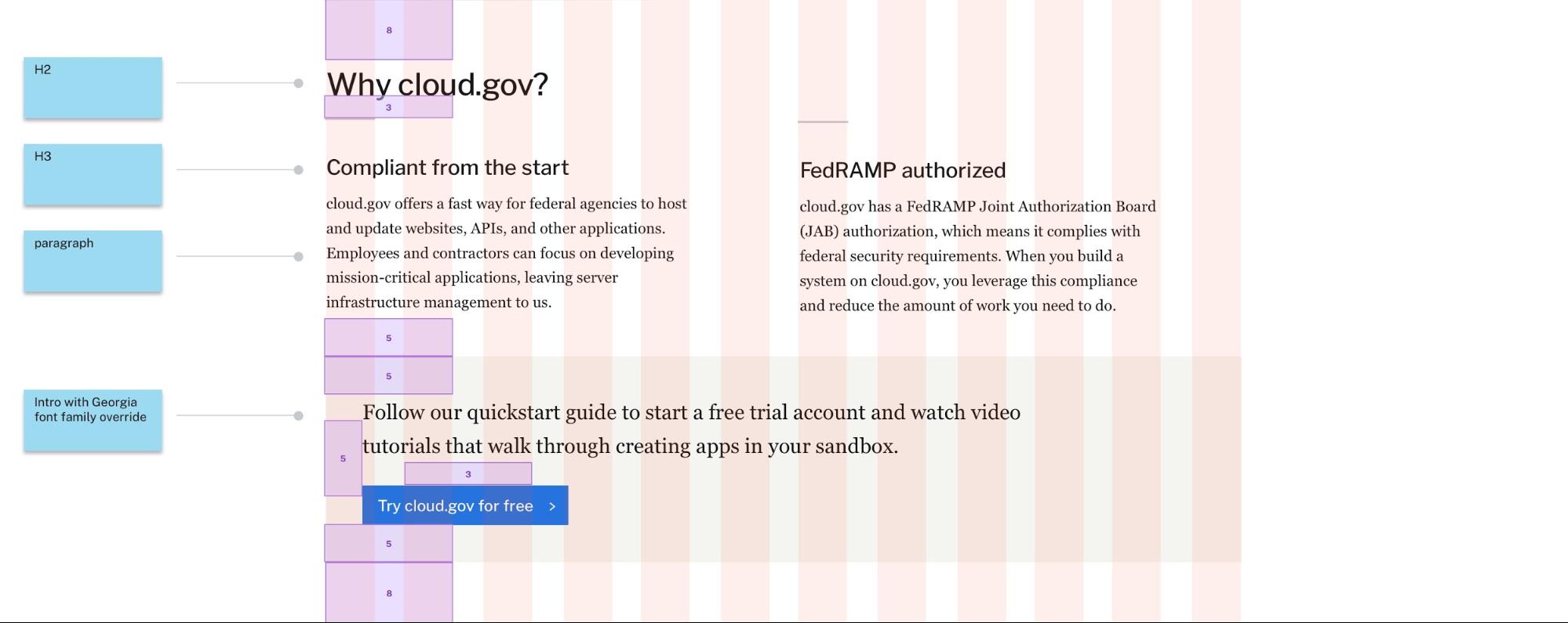
The USWDS grid includes a number of CSS classes and utilities that made it easy for us to prototype quickly. Grid columns classes, which we used heavily, have baked-in responsive behavior, but we could adjust that behavior by adding additional responsive classes to call breakpoints at different times. We could also use auto layout classes to automatically fill the space rather than specifying a specific column width.
It did take us time to learn what the default grid configuration was in
the theme, and how they mapped to sketch resources. We learned that the
desktop 1024px wide artboard with 32px gutters was the closest match
to what developers would get out of the box.
Spacing:
The spacing design tokens helped us create a site with consistent
spacing and limited the amount of custom variations we used, making it
easier to build and design page layouts. USWDS spacing units are based on multiples of 8, and
spacing helpers in the design files helped us think in predefined grid
units, rather than raw pixels. For development, the combination of
utility classes and mixins for spacing (padding and margins) made it
really fast and easy to implement any padding changes once we memorized
the formula of Spacing-type-dimension-unit to communicate
spacing. These spacing units were also used for element and images
heights and weights allowing for repeatable sizing across many parts of
the site.
The drawback of this approach is that it did sometimes make it hard to evaluate in our browsers what the rendered element spacing would be. We also found that some components and layout elements had undocumented spacing (outside of the code), which had to be accounted for when implementing designs.
Closing thoughts
USWDS is a useful, powerful tool for teams building digital services. For us, migrating cloud.gov to the new USWDS meant we could quickly access components with mobile responsiveness, consistency, accessibility, and usability best practices baked in from the start. It also meant that we could help our TTS partners meet the newly issued Web Standards for the 21st Century Idea Act. The flexibility of the system let us keep the brand and spirit of cloud.gov while increasing consistency and usability.
We’re grateful for the USWDS team for their documentation and continued refinements to make the design system easier to use and more accessible. You can become a part of the USWDS community by joining the public USWDS slack channel or submitting feedback or questions to the USWDS github repo.