
We were proud to provide design and development work for the Peace Corps’ new donations platform which will allow the Peace Corps to further its mission by providing funding for volunteer projects. Releasing this project within our tight deadline required us to choose the direction of our efforts carefully; in some cases we think we chose well, we learned lessons from others.
Deciding when to release a project is always a balancing act. We want to build enough features to be useful, but to go live as quickly as possible. Even with years of experience, drawing that “release” line is challenging; we will always over optimize in some areas and under-deliver in others. However, in many cases, a productive application that generates real user feedback is well worth making that call early.
We want to share a few reflections around drawing that delivery line for this new product, and explain where we think we made the right call and look at other decisions which still keep us up at night. By highlighting some of the bigger (and more contentious) decision points, we hope we can help inform your next project(s), as well as our own.
Progressive enhancement
Our effort to refresh the Peace Corps’ donations platform stemmed from many goals, such as highlighting volunteer stories (to humanize the agency), creating an experience optimized for mobile devices, and simplifying the donation process. The last point proved particularly challenging, as we had little control over the payment processor and minimal flexibility in the collections form. Luckily, we could reduce the number of steps between landing on the site and donating. When the user found a compelling story, they could select a donation amount in-line, turning what used to be a four-step process into a single click.
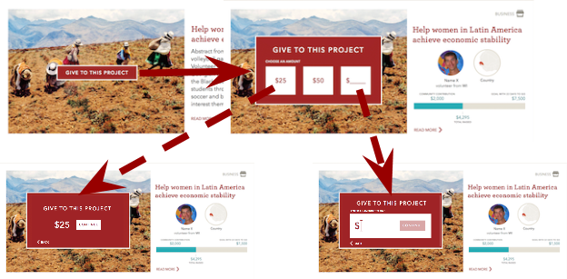
Our ideal interface would have been a seamless user experience, but once scoped would have required a heavy lift from our front end and accessibility teams. We would need to dynamically generate the interface and provide a fallback for users without scripting support. With an eye on the clock, we chose instead to create a simpler form using radio selectors to allow users to select a donation amount. Though this felt clunky and defeated our single-click goal, it worked, so that’s where we started. The budget eventually allowed for additional improvements to this interface to be prioritized. Currently, the experience for most users is roughly one step away from our initial design, but it remains a step away. However, since we released without our optimal solution, we bought time to build some other features (perhaps skipping payment confirmation, perhaps additional sort options). Stepping back and re-prioritizing allowed us to make the product better on the whole.
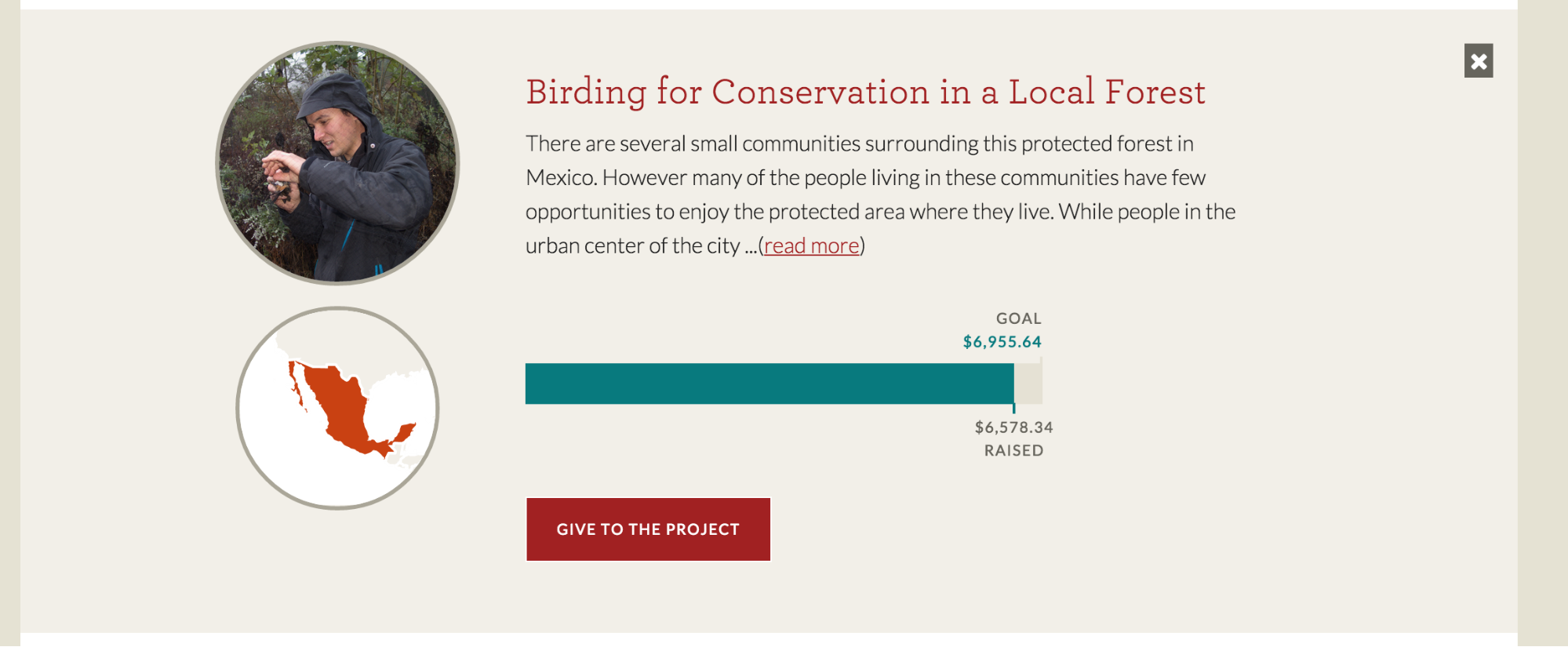
In another situation, starting with a simple solution ultimately led us down a worse path. Our most complex user interaction offers multiple filters and categorization mechanisms for selecting how a user’s donation will be used by the Peace Corps volunteers. A reasonable technical architecture for this sort of page would involve asynchronous requests, where data is transmitted in chunks instead of in one large block, so that the browser only loads what is needed. We chose to start with a simpler approach, however, by including all content in the initial page load and simply hiding elements based on filters. With either strategy, users selecting a specific country would only see projects and funds relevant to that country, but the latter approach requires much more markup. Not long before launching, we realized that this approach led to massive page sizes when using live data. We quickly hacked around this problem via compression on our caching layer, and we later added additional patches to minimize redundant markup. We’re still not where we should be with regards to site load time because our initial approach was too simplistic.
Zero downtime and caching overkill
During our early planning phases, we were informed there might be a couple concurrent announcements by the Peace Corps which could drive significant traffic to our site. As a result, we spent many hours designing and implementing infrastructure that could tolerate large amounts of traffic. We designed an architecture for one component hosted on Amazon Web Services S3 and CloudFront to handle the brunt of the users. The main donations app is protected by a memcache-based layer to keep server load low. It uses tiered caching so that certain data is kicked out every five minutes while other pages are generated hourly. With several machines primed and auto-scaling capability, we expected to handle dozens of requests per second.
After reviewing the numbers from Peace Corps’ media blitz in early March, we know that part of our calculus was correct — S3 and CloudFront did take the brunt of our user load — but our other estimates were wildly off. The absolute number of hits was significantly below our capacity.
While there has been good traffic to the site, we made the wrong call when architecting. Our caching layers led to additional confusion from Peace Corps admin staff, who needed to know that their content may not be “live” for an hour. We didn’t actually need this layer and certainly not the multi-tiered approach we used out of the gate. Our auto-scaling server cluster sits at minimal utilization; we will certainly save money once we spin it down. While the peace of mind is certainly appreciated, the beefy implementation was overkill. If we had instead started with a simpler vision, we would have simpler configuration, leaving less room for confusion and waste.
Cutting features
Replacing legacy (existing, outdated) systems is always a challenge. Not only do we need to find all of the technical boundaries, we are also expected to match (and exceed) existing functionality. Two features of the existing donations portal proved particularly problematic during our design process. Our easy-donation strategy did not account for the dozen or so pieces of donor information the existing system collected. The legacy system also provided a search engine, allowing users to find funds based on keywords. One of these features would make it to launch but the other would not.
We pushed hard to cut as many fields as possible from the donor form, but knew this would be problematic given the number of stakeholders needed for approval. We therefore began a parallel effort to test our backend process with a replica of their existing form. Though it wasn’t our intent, we ended up using a tweaked version of this for launch (after discovering that the process to change the form could delay launch by many months). Here, starting with the simpler approach (duplicating existing fields) meant we did not waste time as we learned our limitations.
We reasoned that the other major missing feature — search — would need either a full-blown search index or a tightly coupled database implementation. This would add nontrivial design and development time that was needed for other, higher-priority features. So we kept the search feature in the backlog (a holding area for features not actively planned). When it came time to release, the feature was still not present. Time will tell whether this tradeoff was worthwhile.
The road ahead
We will no doubt see more dividends and costs associated with our technical choices in the coming months, but we have pulled out the above as a starting point for analysis. Implementing the simplest solution allowed us to add other features (and/or move our launch date up), but some of the initial solutions weren’t actually viable. On the other hand, some optimization efforts were red herrings (e.g. caching) while others now seem like a requirement (e.g. the static site). Ultimately, we recommend you start simple but don’t refuse to dive deep when there’s a good use case.